35 - skeumorphism
Every Apple user will have met Skeumorphism - faux leather in the calendar, tape reels in the (old) Podcast iOS app etc. There is hope, that Jonny Ive will free OSX and iOS from the tired “trying to look like reality” look.
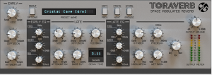
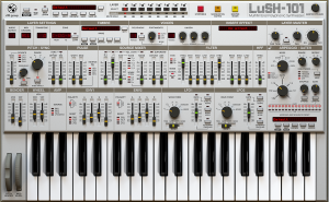
The worst offenders in terms of skeumorphic interfaces however aren’t coming from Cupertino - there are legion of software producers that build interfaces that mimic “reality” down to the shadows on the knobs. Check out these samples:
While these interfaces might look nice, I find them (in general) to be really difficult to work with. Twiddling knobs with a mouse is just plain unpractical. Sliders are a bit better, but also quite difficult to operate.
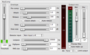
Luckily, there are alternatives (at least some). The DAW I am using, Reaper, is very light on skeumorphism. Yes - the main tracking and mixing area has sliders like on a mixing board, but most other things are blessed with sensible input controls. Thanks for that!
I do wonder though, why the electronic music industry thinks that skeumorphism is a good thing. Ideas?


